Jeremiah Budin reports for Curbed.
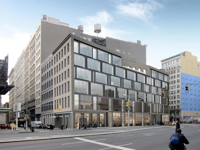
Earlier designs for a triangular building at 19 East Houston Street drew the ire of the both the community and the Landmarks Commission, so Perkins Eastman made significant changes before bringing the plans back this morning. While the original design had called for a primarily glass façade, the new one features a contextual brick façade at Crosby Street and a completely separate façade of staggered glass and recessed metal panels at East Houston, addressing commissioners’ concerns that the building would appear thin and flimsy.
Another concern was the amount of signage that would visible through the glass. The architects took away the option of introducing a huge LED billboard by removing the large, open space where it would have gone and also limited the retail signage by having the ground level appear to be single-height, although it will remain double-height on the interior. All of the commissioners found the new plans approvable except for commissioner Michael Devonshire, who took issue with the windows Crosby Street façade, and commissioner Michael Goldblum, who said that the “overall impression is still one of a flat building” and that the design was “not taking cognizance of the special space in which it finds itself.” In the end, though, it was approved with only one opposed.


